Education
-
The Hong Kong University of Science and Technology (HKUST)
Ph.D., Mechanical Engineering2013 - 2017 -
University of Science and Technology of China (USTC)
B.S., Theoretical and Applied Mechanics2009 - 2013
Research Interests
Honors and Awards
- Shaanxi Sanqin Talent Special Support Plan for Young Top Talents (2025)
- First Prize of the Outstanding Scientific and Technological Research Achievement Award of Shaanxi Higher Education Institutions (Rank 2, 2024)
- Young Elite Scientists Sponsorship Program by the China Association for Science and Technology (2023)
- World's Top 2% of Scientists list by Stanford University (2022, 2023)
Group Gallery
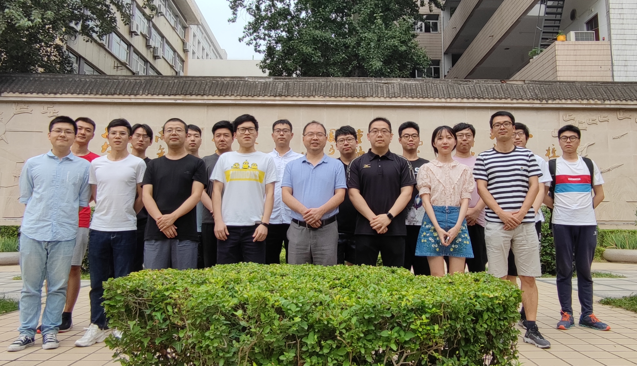
Our group at Northwestern Polytechnical University
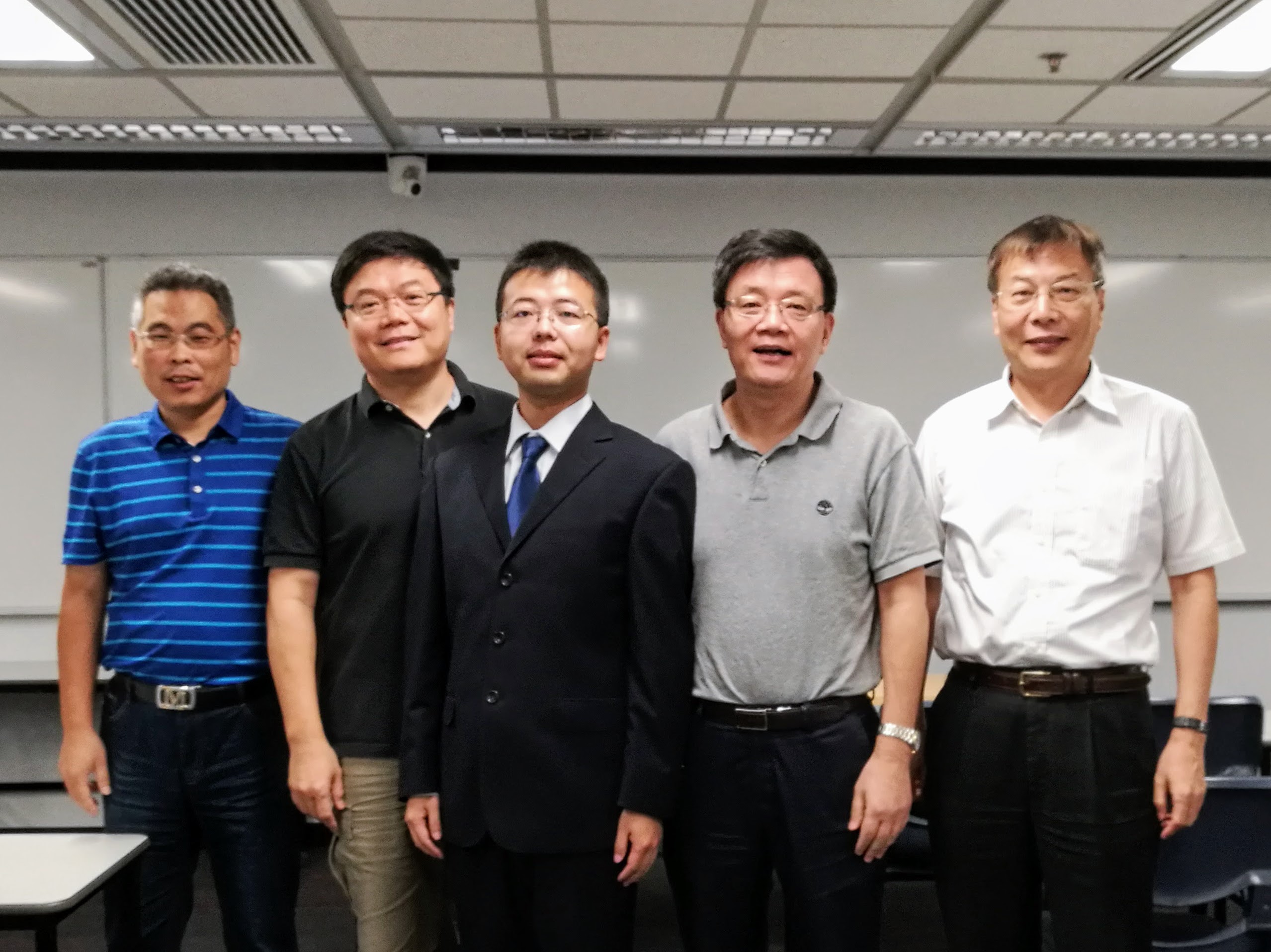
With my PhD thesis examination committee members